Blog
GETTING YOUR BRANDING RIGHT
I just love it when communities truly get their brand and get it right. There are lots of great examples of this out there, but sadly there are more communities out there that don’t “get it.” Kudos to the Town of Morinville, Alberta for “getting it.”
I’m particularly proud of Morinville as this was a project that we worked on with them.

In 2010, Morinville began a coordinated marketing effort to re-brand their community and create a brand for the new Community Cultural Centre. The ultimate goal of the project was to entice residents, visitors and businesses to Morinville and to its new Community Cultural Centre. The project involved a series of in-depth consultations to choose the new brand, the creation of new visual identities, creation of marketing tools, and a Marketing and Communications Plan.
Founded in the late 1800s by Father Morin, an Oblate missionary, Morinville has a unique past that gives Morinville the distinct multi-cultural and architectural character it has today. St. Jean Baptiste Church, built in 1907, is a Gothic style Roman Catholic Church, and was declared a Provincial Historic Site in 1974. The Convent of Notre Dame de la Visitation was built in 1909; it is now home to Musée Morinville Museum and was also declared a Provincial Historic Resource in 1978. These two facilities were identified as some of Morinville’s greatest assets.
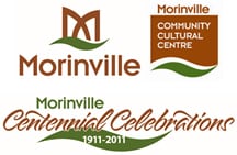
Our colleague Dwayne Holland of Focus Design Group designed the visual identities for the Town and Community Cultural Centre:

The design sought to capture the essence of architectural elements found in St. Jean Baptiste Church, the community’s iconic image. It also uses the letter M – its shape inspired by the historic church’s stained glass windows as well as the wrought-iron fence surrounding the heritage properties in the downtown core. The overlapping shapes are intended to represent community collaboration. Below the M is a stylized leaf intended to represent the community’s trail system.
What impressed me is that Morinville not only completely incorporated all our recommended suggestions – they went above and beyond.
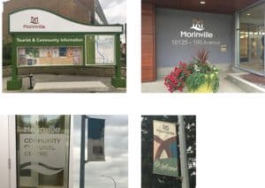
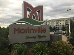
They permeated their branding into their signage, buildings, décor and colour schemes, newsletters and publications just to name a few things.


